High-Density Graphs
Due to one of the more unfortunate flukes in the history of mathematics, collections of objects that consists of points and connections are also called graphs.
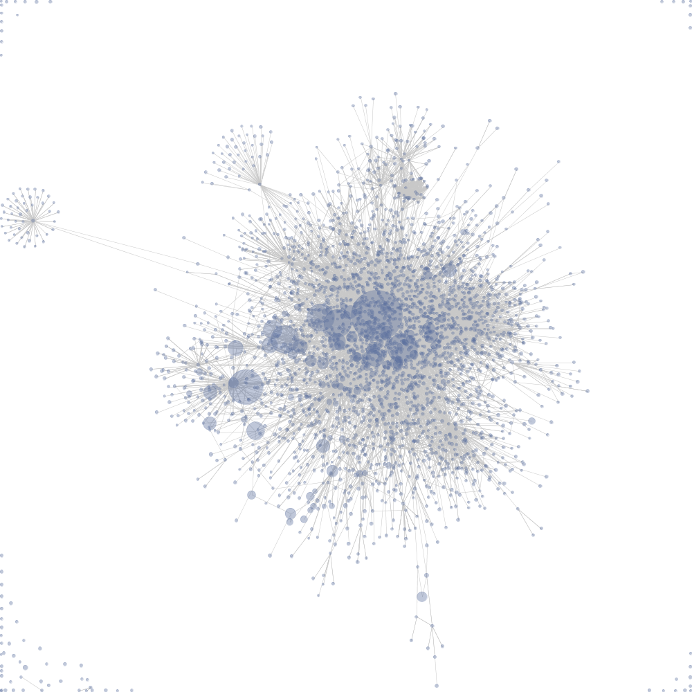
These kinds of graphs generally look like this:
Force Directed Spring Layout of Wiki data, taken from Wikipedia.
Each dot above represents a wiki-page, each line represents a connection between the pages.
Graphs are useful in seeing, in the abstract, the relationships between objects or data points, especially when the type and number of connections are important.
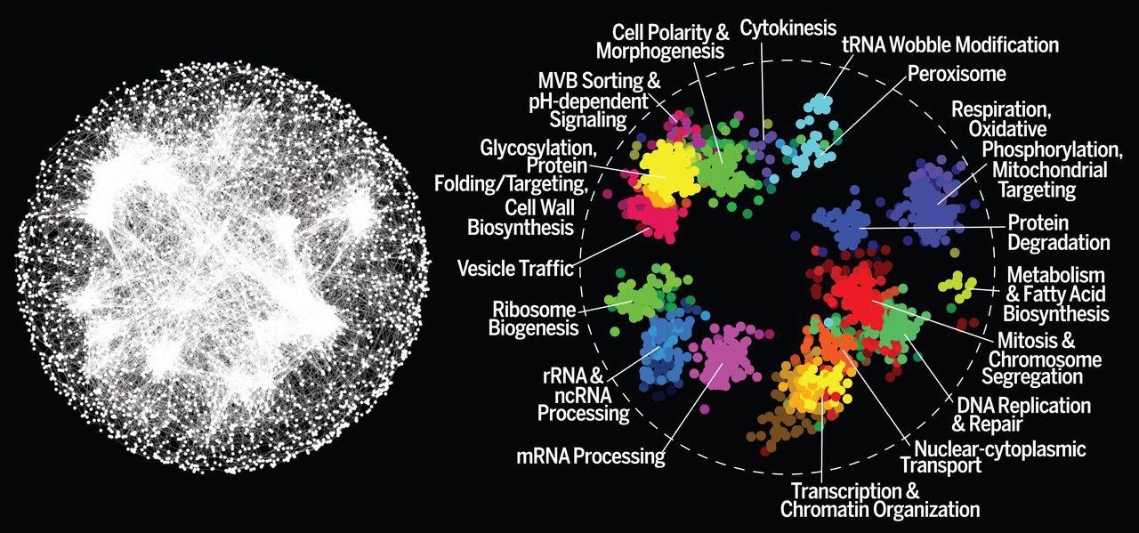
For example, the graph below represents every interaction between every gene in the yeast species Saccharomyces cerevisiae.
Left: A Node and Edge Graph representation of a yeast genome. Right: important clusters of genes. Photo credit.
While interesting, you have surely noticed that both graphs above are very busy in the middle. Something similar happens if you explore the Panama Papers/Offshore Leaks Dataset — the graph of connections gets busy, quick.
The fact that most graphs become hard to understand due to the number of overlapping connections in the center of the graph can be an issue for understanding how entities relate to each other, which was the whole point of using a graph in the first place.
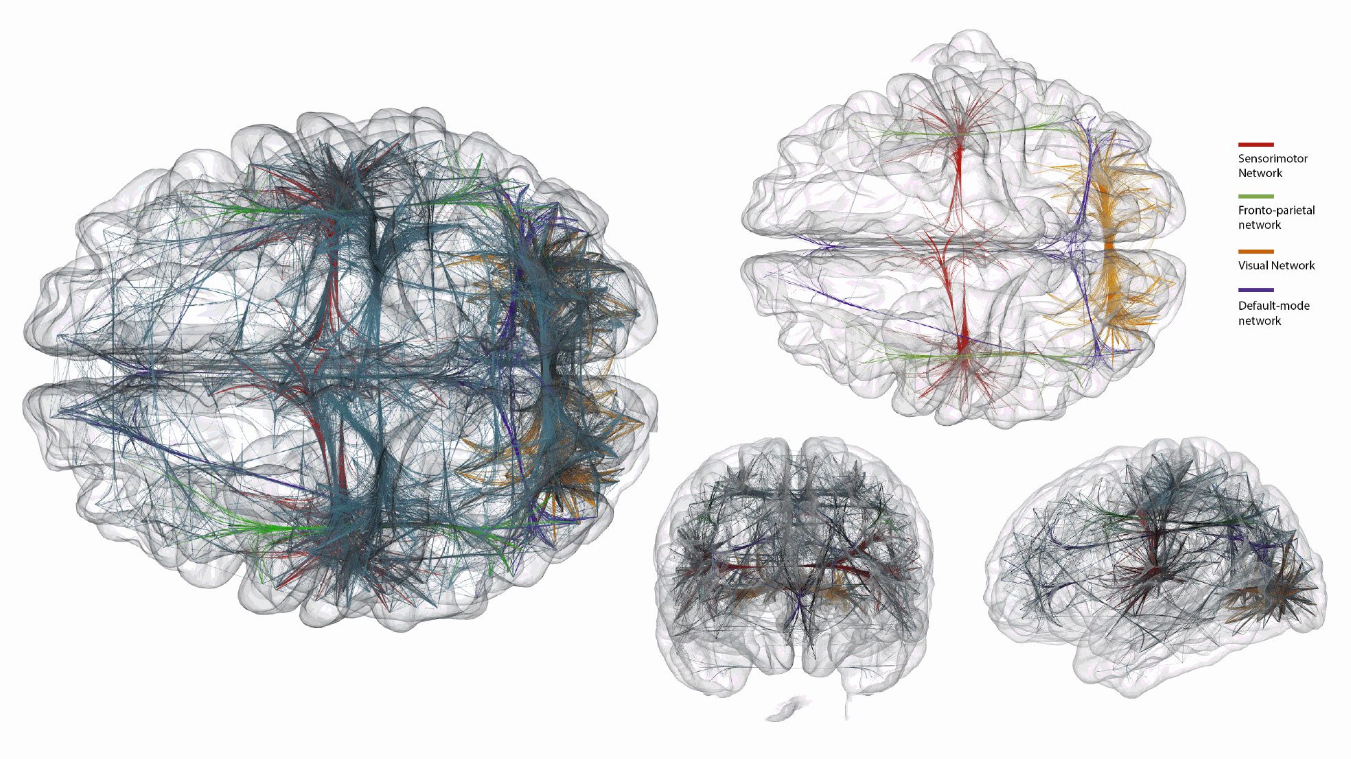
As you might imagine, three-dimensional graph visualization allows for much more breathing room:
A three-dimensional graph visualization of different connected networks in the brain. Photo credit.
However, notice that these visualizations also suffer from the busy-ness problem; even though the authors are using an algorithm to ‘bundle’ the connecting lines together, it is still hard to figure out what exactly is going on. Imagine, however, if you were able to fly into the middle of each of those brains and rapidly change the size and scale of the brain you were now standing the middle of it – the data would be much easier to understand.
Providing Context
Compare the following charts:
Both of these charts use the same underlying data. The left chart was named one of the most misleading charts of 2015.
I submit that while the chart above (or the others in the linked Quartz article) is misleadingly presented, it is misleading to present it as a static image. Being able to explore and change the data’s size, shape and scale can prevent data from being misleading, because the context is baked into the experience.
One of the biggest advantages of using virtual reality to visualize information is that there is no point in sharing just a static VR representation; every VR representation is also automatically an experience. What this means is that the viewer can explore it at her or his will.
VR to the Rescue
While VR data tools are in their nascent stages, here are three examples that combine most of what I’ve mentioned so far.
CalcFlow
The first is CalcFlow a tool developed in concert with the UCSD math department for visualizing 3D math concepts. Currently, it is set up a series of interactive demos that allows a person to get an intuitive understanding of a double integral or the Navier-Stokes equation. You can experience some of the advantages of VR I’ve identified in this piece in each demo: the ability to change scales and “walk around” the data means that the data it is easier to understand. The experiential nature of the demo means the user can make adjustments on the fly and see how it changes the result in multiple dimensions.
DeathTools
DeathTools takes data visualization from abstract numbers into a real, tangible world that we understand in a way fundamentally different than figures and graphs. The experience shows the accumulated body count of recent Middle Eastern conflicts. Instead of a bar chart, you’re literally standing among rows of body bags that accurately represent the number of deaths.
As DeathTools creator Ali Eslami puts it:
One of the pieces that is missing in our knowledge base is the ability to perceive Big Numbers. We have trouble understanding and accepting mass death. For example, numbers like 1; 2; 14; 20; 50, are all quantities that we encounter quite frequently and therefore we’re able to rationalize them with a representative mind model. But then we get to numbers like 1,000; 10,000; 20,000. These numbers become increasingly difficult to conceptualize, but we can still grasp the general meaning of such numbers using visual models of large scale things we encounter often in our little realities.
Kineviz
Lastly, we’ve been working on a VR-enabled, 3D graph exploration tool here at Kineviz. It’s designed to solve some issues around high-information-density and allowing users to intuitively experiences meaningful differences in data. Take a look for yourself:
The major advantages of VR is that it can be used to make perceiving differences in data easier, less dense, and more intuitive. VR also forces data representation to be experiential, which means that it’s much harder to alter the representation of the data to fit a pre-defined story. Finally, VR allows a person to rapidly change the scale of what one is looking at in a way that utilizes one’s spatial awareness and allows the perception of scales of data that are otherwise nearly impossible to imagine.
Page: 1 2