Data visualization is one of a handful of topics that VR evangelists like to count off on their fingers as spaces that virtual reality could radically change. But how, exactly? And what’s wrong with data visualization today? This article digs into specific issues with traditional data visualization and the challenges of understanding abstract information, and how VR is ready to change everything.
Evan is program manager at virtual reality data visualization company Kineviz. He previously worked as a data scientist for HID Global, and he graduated from U.C. Berkeley with a degree in Cognitive Science. When he’s not working for Kineviz and exploring VR, he writes and researches the human decision-making process.
In 1983, Amos Tversky and Daniel Kahneman asked college students the following question:
Linda is thirty-one years old, single, outspoken, and very bright. She majored in philosophy. As a student she was deeply concerned with issues of discrimination and social justice and she also participated in anti-nuclear demonstrations. How likely is that:
- Linda is a teacher in an elementary school?
- Linda works in a bookstore and takes yoga classes?
- Linda is active in the feminist movement?
- Linda is a psychiatric social worker?
- Linda is a member of the League of Women Voters?
- Linda is a bank teller?
- Linda is an insurance salesperson?
- Linda is a bank teller and is active in the feminist movement?
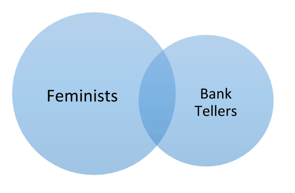
They found that 86% of undergraduates believed that #8 (Linda is a bank teller and is active in the feminist movement) was a more likely scenario than #6. While it is easier to imagine Linda being both feminist and a bank teller; ‘feminist bank tellers’ are only one kind of bank teller, and thus there are less feminist bank tellers than total bank tellers.
Not only is this example well known, most people find it confusing. Notice how much easier it is to understand when it is visualized:
Which is more likely: that Linda is a Bank Teller, or a Feminist Bank Teller? Assume the circles are sized proportional to reality.
Virtual reality has the potential to make probabilistic reasoning easy, just like this diagram made the so-called “Linda Problem” much easier.
– – — – –
Talking about data and virtual reality is a bit of chicken and egg problem — it’s difficult to build a suite of VR tools that people will use without knowing how said people will use VR data tools. That being said, virtual reality can help with a) probabilistic thinking (illustrated above), b) high dimensional data visualization, c) high information density, and d) providing context to fully understand what is going on.
High-Dimensional Data Visualization
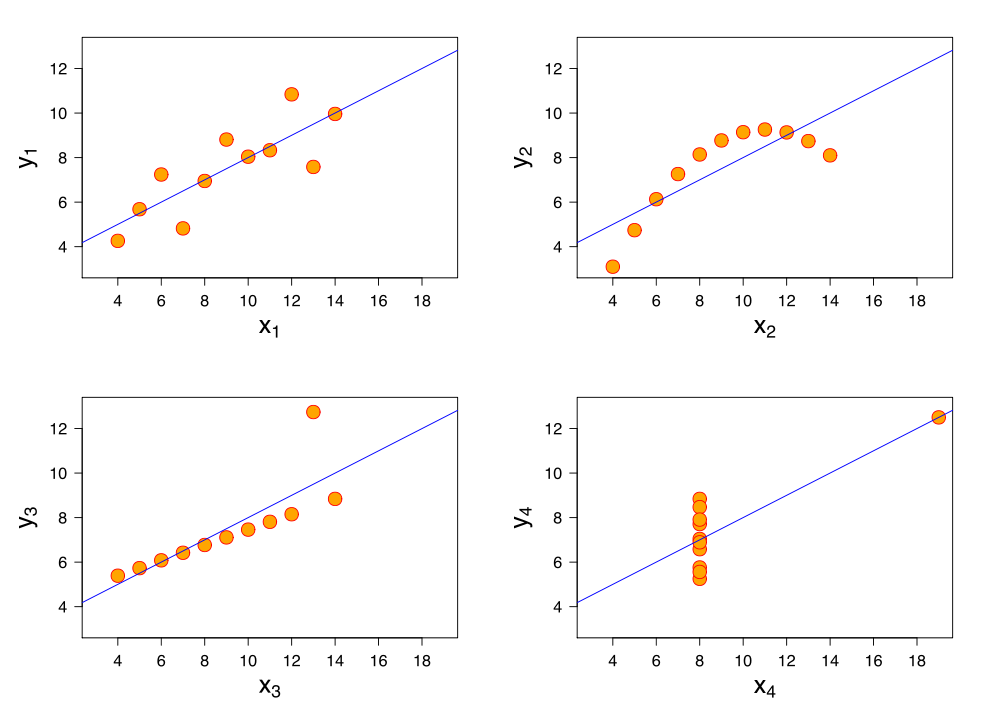
“Graphs are essential to good statistical analysis.” – F.J. Anscombe
Provided your dataset has two dimensions or fewer, the respective data is relatively easy to visualize with graphs or charts:
Anscombe’s famous quartet, taken from Wikipedia. Each data set has the same mean, correlation, variance, and best-fit line.
For each dataset above, the mean of all of the X coordinates is 9, the mean of all of the Y coordinates is 7.50, the variance of the X coordinates is 11, the correlation between the X and Y coordinates is .816, and the equation for the best-fit line in each case is Y = 3 + 5x.
In other words, these four datasets are seemingly statistically identical, even though their true nature is betrayed by visualization. However, we had it easy—we were only working with two dimensions of data.
– – — – –
If you have three-dimensions worth of data, you could conceivably use a three dimensional plot. If you have high dimensional data (aka plenty of columns in an Excel spreadsheet of your data), you are mostly out of luck. While it is easy enough to think in 2D, the trouble with having a lot of columns (like 10,000, for instance, but also anything greater than 3) in your dataset is that it is impossible to visualize more than three spatial dimensions.
However, there are other ways of representing dimensions. A triangle, for instance, could be used to represent three dimensions of data, if you mapped each dimension to the length of a side. You could, if you really wanted, utilize a red-blue spectrum and a light-dark spectrum to color in the middle of the triangles and blamo! You’ve got five continuous dimensions all in one visualization. Compare each triangle, and you might spot anomalies or heretofore hidden patterns and relationships. That’s the theory, anyway.
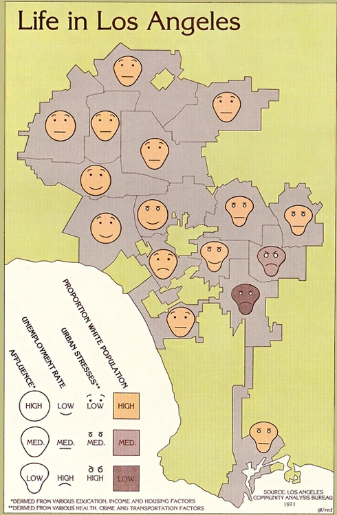
Herman Chernoff explored a variant of this idea in the ’70s — instead of lengths of triangle-sides, he mapped dimensions of data to different characteristics of cartoon faces.
I’ll let you judge how well this worked by way of an L.A. Times infographic:
Eugene Turner — Life in Los Angeles (1977), L.A. Times. The four facial dimensions, the geographic distribution of each face and the community line information mean you are looking at six dimensions of data.
Your gut reaction will be to dismiss this method of data presentation, as it looks silly, vaguely racist, and hard to interpret. But I urge you to give it a second look — can you spot the buffering row of communities in between the poor and affluent parts of town?
One reason Chernoff faces don’t get wider use, I submit, is that they look too cartoonish (and seeing how science is very Serious Business, it wouldn’t be proper for plots to be cartoon faces…). While realistic Chernoff faces solve the cartoonishness problem, they highlight another issue: though they seem like they could be intuitive, we all have too much experience with faces and real emotions to evaluate arbitrarily constructed ones.
In the depictions below, parameters of Tim Cook’s face — like the slope of his eyebrows — have been mapped to various Apple financial data-points for the year in question.
From Christo Allegra. Each version of Tim Cook’s face represents Apple’s financial data for the year in question. The width of Tim Cook’s nose represents the amount of debt taken on by Apple; the closed-ness of Cook’s mouth represents the revenue of that year; the size of his eyes represents the earnings per share, and so on. For serious uses of Chernoff faces, check out Dan Dorling’s work.
Clearly, there are some issues with this approach too. One thing that stands out is that not every aspect of a face conveys emotional information on the same scale as, for instance, the smile. In other words, the perceptual difference between one face and another doesn’t match the actual differences between the data. This, I submit, is one of the properties that makes plots and graphs so useful. It’s why visualizing the Linda Problem makes it much more intuitive. It is also something that is missing from current approaches high-dimensional data visualization.
– – — – –
Virtual reality can solve several of the aforementioned issues. Instead of faces, a Chernoff-like technique can be applied to control how neutral objects look, move, interact and are distributed. For example, all of the following properties of tables can be used to represent different data dimensions: height, area of table-top, color, leg-length, degree of table polish, as well as type and location of stains and burns. If you have 15-dimensional data, you could do worse than translate the dimensions to parameters that would control how tables might look.
Each measurement can be utilized to visualize another dimension of data. From mycarpentry.com.
The advantage of VR is that it allows you to perceive the true, intuitive, meaning of a table that is twice as tall as another; or the meaning of having different coefficients of friction on the table top. Some testing could ensure that the differences in dimensions carry the same perceptual weight.
Moreover, the methodology for how to go about this has been thoroughly explored in the realm of psychophysics and color perception — researchers have spent a vast amount of time measuring how people perceive both tiny and large differences in different kinds of sensations. In other words, VR and a little psycho-physics could make understanding complex data as easy (or stress inducing) as walking through IKEA.
Continue Reading on Page 2 >>
Page: 1 2