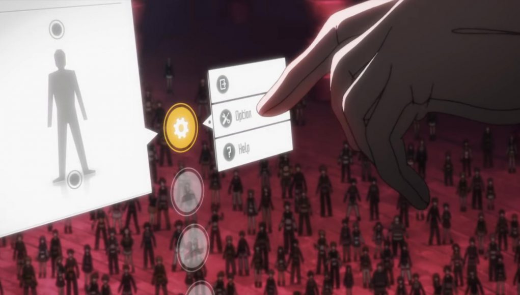
Looking to immerse yourself into Sword Art Online (SAO)? While there are plenty of VR games that offer the sort of massive multiplayer immersion fans of the manga and anime series have craved over the years, a game built for Quest Pro and Quest 2 has recreated probably the best/worst part of the series: its lovably bad user interface (UI).

Called Subspace Hunter, the SideQuest-only game is essentially in very early access at this point. The demo lets you spawn a certain number of swords, magic, guns, and thirteen monsters, developer XuKing Studio explains on the game’s SideQuest page.

The cheap and cheerful demo (it’s free) is unabashedly inspired by SAO through and through, even including a one-handed sword very similar to protagonist Kirito’s Dark Repulser blade. YouTuber ‘GingasVR’ shows off the demo in action:

While the low poly baddies aren’t anything to write home about, it’s the loyal adherence to Sword Art Online’s lovably obtuse UI that brings it all together, making it feel strangely more immersive than it might without it—and that’s despite the likelihood no professional XR developer in their right minds would design such a system for real-time battle.

In case you didn’t catch the video above, to select a weapon you don’t just pull out a virtual backpack, or reach over your shoulder like in many other VR games. Instead, you need to bring up the menu with a sweeping two-finger swiping gesture, select through three different 2D submenus, and then physically confirm your selection. Although that’s no more complicated than ordering through a fastfood kiosk, it’s not really the best system for immersive, real-time action games. Thankfully, you can control when monsters spawn, otherwise you probably wouldn’t have enough time to muck about.

SEE ALSO
Meta is Deleting All Old Oculus Accounts by Month's End, Severing Another Tie to "the good old days"

That’s probably why we don’t see these sorts of dense 2D menus in modern VR games. But then again, it was never designed for any sort of game in the first place, since the anime aired in 2012 well before the Oculus Rift DK1 even arrived on Kickstarter backers’ doorsteps. By now though, the industry has mostly figured that 2D menus generally feel pretty bad to use in VR, making SAO’s fictional UI feel distinctly like a holdover from the gaming days of yore (think turn-based RPGs).

As it is, fiction typically does a pretty poor job across the board of predicting how UI actually evolves. Film and TV oftentimes prioritize large, overly complex movements and cluttered UI elements that just don’t really translate to real life. Tom Cruise’s cybergloves in Minority Report (2002) are a shining example.


You don’t see platform holders or individual games copying Minority Report not because it doesn’t look cool, but because it introduces unnecessary friction. It’s both tiring in the long term and unintuitive to new users in the short term—two things developers really have to pay attention to if they want players returning to their game or app. It’s basically the same thing for SAO, albeit on a smaller scale.

To be clear, this isn’t a dump on Subspace Hunter. The melee-focused MR demo offers SAO fans a very nice slice of immersion which is baked into a suitably pint-sized package. Critically, Subspace Hunter isn’t overreaching with promises of a VRMMOPRG the scale and depth of SAO eitherwhich is probably where such a system might wear out its welcome. Whatever the case, there’s something stupidly charming about those sweeping hand motions, and the fitful hunt-and-pecking of 2D menus.

It seems like the studio has some very real ambitions to develop Subspace Hunter further, and you’re not going to have threaten me with the risk of explosive brain death to play either. I’ll just play.

Newsletter graphic

This article may contain affiliate links. If you click an affiliate link and buy a product we may receive a small commission which helps support the publication. More information.


Well before the first modern XR products hit the market, Scott recognized the potential of the technology and set out to understand and document its growth. He has been professionally reporting on the space for nearly a decade as Editor at Road to VR, authoring more than 3,500 articles on the topic. Scott brings that seasoned insight to his reporting from major industry events across the globe.
  • Nothing to see here

    The point is that almost any VR game would be better if it ditched the “immersive” UI elements (like reaching over your shoulder) and instead let us use a Playstation or Xbox controller so we could focus on the game and not trying to grab something that does not really exist. You know there is a reason why the PS5 and Xbox controllers bear a strong resemblance to the original PlayStation controller.

    • Anonymous

      Totally illogical argument lmao.

    • Ookami

      Hard disagree. I much prefer virtual holster for items over a tradition ui/button based version.

      • John G

        That was the brilliance of the Alyx interface. Once you got used to it, you could ‘feel’ like you were selecting the weapons, but you could also go slow and look at it as a UI.

        Brilliant. Subtle, and think of all the work to get that subtly perfect.

        • Ookami

          Yeah it worked for the game, but I’m fine with dealing with the jank that comes with a Pavlov-style system.

    • Jistuce

      There are games where a joystick or gamepad is the right answer. But they are not a universal answer.

      Hell, they aren’t the universal best answer for flatscreen gaming, they’re just the answer that’s guaranteed to be available.

  • Andrey

    Oops, now you’ve triggered me (and now I most probably will be blocked again, because of my answer not being “right”). The “author” of this article either haven’t played a lot of games (not only for VR, but in general) and haven’t seen REALLY bad UIs or just doesn’t know anything about UI at all, because calling really prodigious UI of SAO “obtuse” is something that can not be forgiven. I could start rambling in a big wall of text why is that so, but I will at least try to be modest this one time.
    First thing – it was introduced in 2012 (!) by anime creators, not developers (!!) way before release of the original Oculus Rift and even DKs. That’s the “prodigious” part – way ahead of it’s time.
    Second thing – it was recreated HUNDREDS if not [dozens of] THOUSANDS of times by people all over the world including myself. If it’s so “bad” – why? Why people did and still do it? Just because it’s “from SAO”? Sure, it is part of it, but the main reason is because it’s very logical and comfortable by it’s initial design. It’s not just a @&^%$! big window that floats in front of you and you just point and click with your controller like you would do with your mouse. It is a small personal window and you need to actually do the main thing that makes VR so cool – interact with it in a natural way with your hands/fingers, not just by pressing button to open a menu and then clicking something there with a cursor moving by your controller’s movement with just your wrist while you hand literally just hanging from your shoulder (let’s not forget that there were no controllers in original title too). It’s both simple and sophisticated by how it looks and works and if we are talking about MMO with all of it’s features (friend list and messaging, big inventory for everything category of items, game’s settings, map, etc.) I would like to see how it can be done otherwise in a “backpack” or “gloves ‘pockets” format without being a complete UI disaster when user needs to remember where on their body something is.
    A quick question – is Direct Touch that was introuduced by Meta a couple of month ago and can be performed both with controllers and just hand tracking is also “obtuse”, because it’s actually doing the very same thing? Just interested.
    So, no – SAO’s UI is very, very, VERY cool looking and comfortable to use (and not just menu, but literally everything else like popping out UI elements (nickname, level, HP bar, etc.) only when you look at a player/mob/boss [head] and so on) and by no means can be called “bad” by a sane person. You can dislike anime in general or SAO in particular (it’s not for everyone, sure), but this one thing can’t be – and shoudn’t be – underestimated.
    P.S. – It is still a wall of text, sorry.

    • Andrey

      And, just to be clear (yes, I read the article AFTER I’ve wrote my comment, I am sorry!), SAO’s UI doesn’t interfere with “immersivity of the action game” too like it was shown in this – imo pretty bad – demo. With the menu you just get access to what you need (like if you want to change a sword) and then it spawns in the sheeth over your shoulder/hip/wherever you choose and can be withdrawn from there manually like in any other VR game (it was literally shown in the very first season in the episode “The Blue Eyed Demon” when Kirito midbattle opened menu and spawned the second sword behind his back). So, again, no – if it’s implemented correctly, it works just great.

      • Bryndyn Williams

        I agree I don’t know what they mean by “bad ui” i’ve had no issues with the way the UI looked and to me it really fit with the game I swear people always have something to say

        • John G

          There’s no UI in your car, say, or your front door. So any UI is automatically going to be immersion killing.

          The Anime wasn’t VR. So it had to show a UI, for pancake audiences. That doesn’t mean the UI needed to be persisted when we really do have full immersion – because it breaks immersion. It’s just clumsy.

          HL Alyx was perfect in that regard. You could go slow, and it was like a UI, but once you got the feeling of it, it was like reaching out and grabbing a gun.

          • Jistuce

            I mean, there IS a UI in your car and your front door(albeit very minimal in the door’s case). You just don’t think about it as such.

            I’ve actually complained about door UI. Most of the doors in my house, the lock lever is oriented so that – is locked, but one is oriented so that | is locked. It annoys the crap out of me.
            And I’ve done full-on rants about my car door locks, where you have to rotate the key different directions to unlock them depending which side of the car you’re on. Terrible UI, 0/10.

          • John G

            Oh, sure, but those are physical objects within the world. So to recreate in VR, it’s not done with a floaty panel in mid air

            Even though the “Minority Report” UI seems to be the rage in Hollywood. In reality, it would be terrible.

    • Jistuce

      Sword Art doesn’t even have the best UI designed by Kawahara Reki.

  • John G

    That monster reminds me of a Kobold from FFXIV

    Good thing no one’s done a Final Fantasy or World of Warcraft immersive version, or people would live in VR

    == John ==

  • Christian Schildwaechter

    I was absolutely fascinated when I discovered “Save Room – Organization Puzzle”, which basically implements the original RE4 inventory system and drops the rest of the game. Now there are those that really appreciate the auto-sorting function in the remake, but with 97%/1.4K+ ratings for Save Room, there is clearly a market for “overly” complex interfaces, as interacting with that interface can be an interesting challenge and meta game all by itself.

    So a more fitting description than “lovely bad/obtuse UI” for the SOA interface might be “not (optimized to be) efficient”, as it requires a lot of steps to achieve a selection and adds a lot of complexity for those not familiar with it. In contrast many games optimize the process with e.g. quick weapon select options.

    But efficiency is not the only possible design objective. Here “nostalgia” was the driving reason, but others are nudging players towards a certain play style, trying to emphasize that lots of complex options are available, or simply making the cost of using the interface part of the strategy (“Do I spend the time to call the menu and switch to a better weapon and risk getting hit, or do I continue with what I currently hold?”). Most interfaces aim to improve usability for unexperienced users, but e.g. the Blender community valued speed/efficiency for experienced users over learnability for a long time, and in games like QWOP, Surgeon Simulator or I Am Bread, the barely usable interface is the actual core of the gameplay.