Echo Arena Lobby Touchscreens
When developing the touch screen interfaces for the lobby of Echo Arena we held to many of the same goals and design ideas found in the single-player objective system. However, as one might imagine, the multiplayer nature of Echo Arena adds whole new layer of considerations. We’ll be looking at how actions common in multiplayer game menus—specifically entering matchmaking, customizing one’s avatar, and setting up a private match—were adjusted from their traditional gaming norms to fit the needs of Echo Arena.
Instead of going over each individual feature, we’re going to focus on relevant highlights and unique elements:
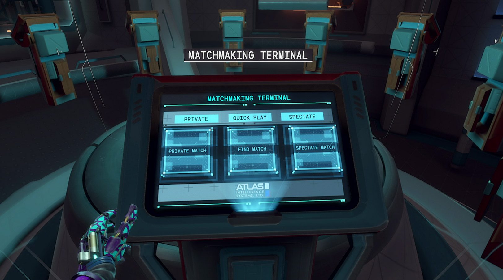
Menus -> Lobby: Early on in the development of Echo Arena we decided that it would be a very worthwhile endeavor to allow all of these meta-game actions to be performed in a lobby with other players instead of within an isolated menu like most traditional games. As I’m sure many a multiplayer gamer can attest to, sitting at a menu while waiting for the matchmaker to find a match can be painfully boring. In traditional gaming, one has the option to shift their attention elsewhere—to look out a window, maybe eat some food, etc. In VR, sitting at a menu means you’re completely surrounded by that menu without access to distraction, making an already painful wait now unbearable. By allowing VR goers to play around in a multiplayer lobby where they can socially engage with one another, practice their skills, or simply muck around with toys, we hope to have offset that pain considerably.
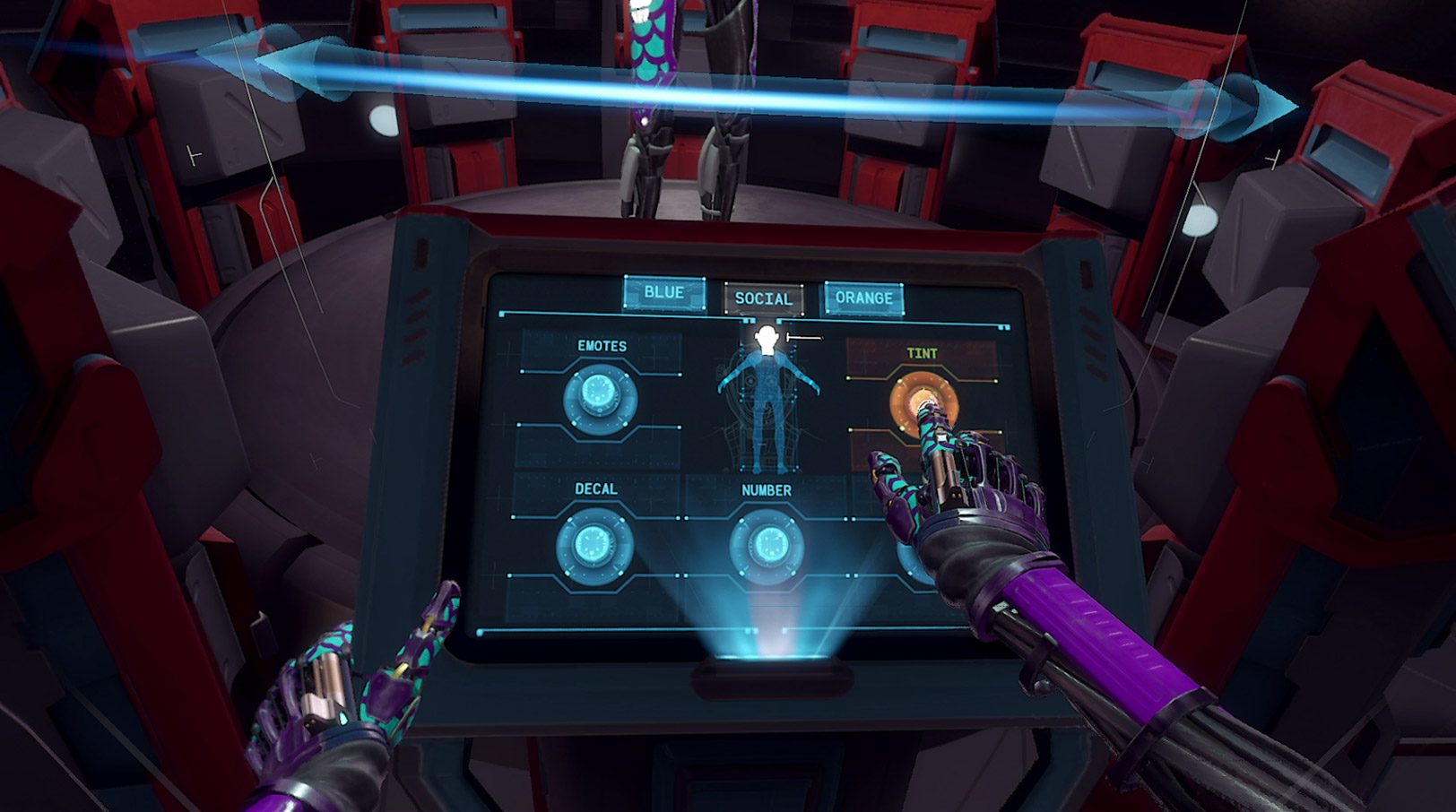
Making the Space Shareable: In order to fully leverage those benefits of the lobby, we had to make sure that the environment and the UI screens contained within it were appropriately shareable. What we found is that—like with seats on a bus—most players will simply go to the next open spot. Therefore, by simply providing enough podiums for almost everyone to use, there is practically always an open spot and therefore a place where someone can access whichever touchscreen they need without trouble. Additionally, the character customization preview ‘dummy’ can be spun so that players can always make it face them[11].
The Ultimate Button: Creating a ‘physical’ (albeit holographic) button in VR allows for nearly all of the benefits of both a digital and physical button. Like a digital button, it can change its appearance to indicate its state (e.g. changing color to indicate that its option has been selected, or even outright disappearing when no longer relevant). However, like a physical button, it can allow for partial-pressing, direct haptic feedback upon being pressed (though not to the same degree within VR… yet), and much larger sizes (by not necessarily being bound to a screen). Additionally, that size and physicality allowed us to leverage both the finger-precision benefits of large buttons and the intuitive benefits of buttons physically sticking up above a surface (thereby implying that they can be pressed down to said surface). However, one drawback these buttons do experience is that they don’t work well in situations where scrolling is required: a cropped-off 3D button ends up just looking very strange.
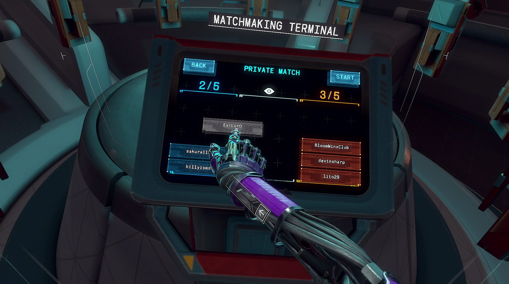
Team Assignment Screen: The development of this screen in particular was one of those lucky cases where feasibility, usability, and effectiveness all aligned. While the original specification involved a three-column list just as the final version does, it relied on additional buttons to switch players between the different teams. By creating a non-functioning prototype of that layout we found it was difficult to get the UI to fit, tedious to use (requiring lots of button presses), and unintuitive (after moving a player between teams, do they stay selected or does selection remain in the list they came from? Different users had different expectations…).
It was then that we realized we were trying to take a digital interface and move it into the world of physical interaction; by taking a step back and looking at how one would prefer to solve this problem physically we landed on the current design[12]. As with our other interfaces that aim to leverage physical interaction for its intuitive nature, a certain degree of physical simulation was required (in this case, retaining velocity from sliding) to make the interface feel natural and polished, but I believe the additional work as well worth it when I see how quickly and easily players are able to assign teams.
That covers the particulars of the multiplayer touchscreens and wraps up our look into designing UI throughout Lone Echo and Echo Arena. As you can see, designing UI for VR presents a lot of new challenges, but also opportunities; it presents a unique world where the incredible possibilities of the digital meet with the rules and expectations of the physical, creating an exciting challenge as we try to discover how to balance the two. As VR advances, there will surely be plenty more discoveries to be made… while we here at Ready At Dawn will continue to work toward those discoveries, we also look forward to enjoying the incredible discoveries of others. To that end, we’re happy to share the knowledge that we’ve uncovered in the hope that it helps any and all to move forward and onto their next amazing VR discovery.
— Footnotes —
[11] Like all of our UI, this orientation isn’t replicated over the network, allowing one player to spin the dummy to their liking without interfering with another player’s view. We find this is important both for allowing players to easily do what they want without encumbering others, but also to afford players a certain sense of privacy.
[12] Fortunately, the removal of those buttons and the additional state tracking that they required actually made the interface easier to build: each nametag independently knows what team it’s on and where it should be positioned—the only significant management required is a simple structure that tracks the size of each team.


